Early Versions: Wait, You Don’t Go to Japan?
In my last Designer Diary, I talked about the curation of the cards. This time I want to talk more about the design. Let’s Go! To Japan was a game about planning a trip, rather than going on the actual trip. This confused people more than I thought it would. You always would “Go on the trip” when you were scoring, but people felt a little robbed. Peter McPherson, designer of Tiny Towns, recommended that since I already had this phase in the game, I should add to it. What sort of decisions and role play could you have during this phase? The walk mechanism was also added to the game for this reason, people would be forced to make choices as they scored. I experimented with more mechanisms that ultimately didn’t stick around. For example, you could pay for extras on activities, e.g. Zojoji temple is free but you could pay extra to visit the Mausoleum (which costs extra in real life). There was dice rolling! This was a bit like a D&D game. Sometimes you had to roll dice in order to have extra fun at the activity. Would you like the Natto you just tried? Would you win money at Pachinko? Most of these were cut for streamlining purposes, but the walks and the optional storytelling variant at the end of the game, which for some people is their favorite part, had to stay in the game to make it feel like you were on the trip.

Simulation vs Stimulation
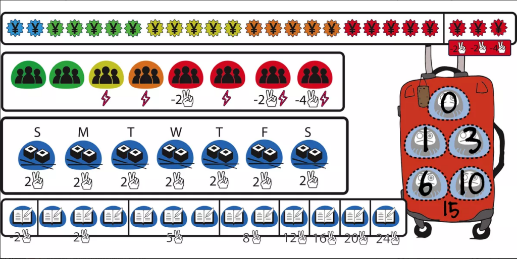
There have been a lot of mechanisms cut from Let’s Go in order to make it more streamlined, most of them were odd things that helped simulate the less enjoyable sides of travel. Originally players had a budget, they started with 30 “currency” and had to pay for the cards they played. I felt this made the game interesting since it’s an important part of travel. Where do players decide to splurge? Do they lose points and put their trip on their credit card? Do they stay in capsule hotels and eat at Konbinis to save a few yen? This was the last and possibly hardest mechanism that I cut, but the game is better without it. I was able to mildly keep this concept in through the red and green arrows. I wanted the cards to maintain their texture without too much headache and this was a good solution.
As I mentioned before, one thing I thought about a lot when I planned my trip to Japan was where I was going to be at certain times of the day. Some places are closed on certain days, some things are crowded during the day, some things are better at night. I had meticulous notes about when things are open in Japan… While the game was accurate, maybe I was indeed too into the weeds and needed to remember that fun was the most important objective to keep in mind.
When Did Stacking Cards Become the Game?
Good question, Paragraph Header. In Let’s Go! To Japan players stack three cards each day so three top halves of cards are shown while the bottom card is fully exposed. This bottom card, their “featured activity,” gives the player a goal for each day of their trip. There was a point when people started asking for more goals in the game. The way I initially tried to add this feature was by giving people three goal cards that they had to play at the end of three separate days. This was fun but ultimately players wanted to choose their goals. I had tried to make a game before Cat Lady that involved stacking cards and I felt this was a good time to experiment with it again.There were two types of goals: “Before” and “Today.” “Before” goals are what remain in the game, “When you score this card you have to already have done this.” Whereas “Today” goals you would have to have all of the requirements on that day. I fought hard to keep the “Today” goals in the game, but ultimately cutting them streamlined things which made it easier to teach. Plus they became redundant once I added the day completion bonuses. This new stacking system gave people a lot of freedom and it allowed the cards to have more variance from one another. There can be two Tokyo Tower cards in the game, but each one could be different from the others.
This system also helped players create story beats on their vacation. The featured activities score better based on what you have done in the past. You excel at the cooking class if you’ve eaten a lot of Japanese food, you find the hot springs of the onsen more enticing if you’ve done a lot of physical activities on your trip, etc. The COO of AEG, Ryan Dancey, described Let’s Go! To Japan as an engine builder where you only run your engine once. I never thought of my game in these terms, but now I feel it helps people understand the timeline and narrative style I was going for and I now embrace the description.
Art, Graphics, and A Lot of Time on Instagram
For Let’s Go! To Japan I wanted to use Japanese artists and artists who live in Japan. I felt that it would help players feel like they were there if the images were captured by people who were actually there. One of the artists, Toshiyuki Hara, would only draw images if he could actually go to the location. This really helped give a sense of being there when he drew images such as Ikebukuro and the Imperial Gardens. Kailene Falls would order the food so she could illustrate what was actually prepared for her.
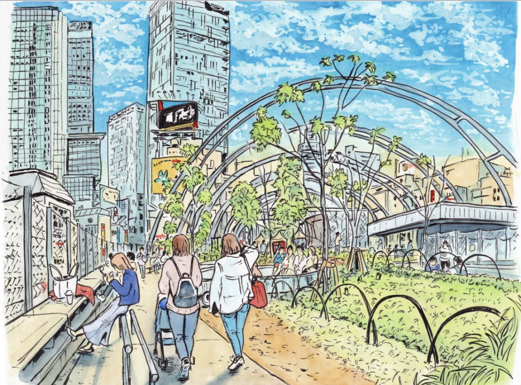
“A lot of time on Instagram,” is how I answer when people ask me how I find first time artists. Typically, I get an idea of what style I think would work best for a particular project. When I find an artist I like, I follow them on Instagram, and then go through every artist they follow as well. Artists tend to follow artists that are similar to them and also just other good artists. This strategy was key to me for this game. Not only did I need to find one artist, I needed to find a bunch and they needed to have an intimate knowledge of Japan. My first artist was Erica Ward, who did the bulk of the art as well as the game’s amazing cover and was an absolute savior to the project.
I spent a significant amount of time finding artists for Let’s Go! To Japan, writing messages in Japanese at times, and had a lot of sleepless nights worrying about the budget. Thank you to all the artists who delivered all of these amazing images in the game.
Brigette Indelicato is someone that I highly trust whenever I need graphic design. For Santa Monica she really helped push the beachy feeling in that game and I knew she would do amazing work on this game. She also had to cancel her trip to Japan due to Covid, so it felt extra special that she got to work on this game. During this project she also had a baby, so I feel extremely grateful for all of her work she put in.
In fact, I am extremely grateful for the work everyone put into Let’s Go! To Japan. I had many nights where I struggled to sleep through my anxious thoughts. I spent more hours worrying about the outcome of this game. I want to thank my coworkers for helping me through this project. The development team I work with is filled with extremely smart people who pushed me to make a better game with each iteration. Luke Peterschmit and Adelheid Zimmerman managed me and got the best product out of me. My cultural consultants taught me so much about Japan, and in the case of Machiko, taught me how to speak Japanese. Andre Chautard went through every card with me helping express my thoughts on the cards. John Zinser for trusting me. And I want to thank the people at this company whose work is just starting: Sales, marketing, licensing, and everyone on the Kickstarter team. I know they are going to spread the word of this game and share my love of Japan.
And thank you for reading about this game. I really hope you love playing as much as I enjoyed making it.

